Rebranding Carnegie UK

- By Natasha Roe, Director and Brand Strategist, Red Pencil
- 13 August 2021
- 5 minute read
We had three clear frames when commissioned to rebrand Carnegie UK Trust.
- Base the rebrand on values the team had developed.
- Foreground Carnegie UK’s renewed focus on wellbeing.
- Move away from a look and feel of traditional grant-giving foundations.
Helen Holden and I build charity brands by starting from the values, bringing together expertise from verbal and visual brand execution. Bringing the values to life is a key feature of what distinguishes charity brands from their corporate counterparts. That, and the fact that non-profits come with their histories, foundation stories and human relationships ready baked in. Our job is to take these ingredients and connect them to outside audiences.
Early in the process, we worked with the staff team to co-produce values statements accompanied by explicit pledges so that these values can be actively lived. These are those statements and pledges.
Motivated by change – we are galvanised by wellbeing approaches that change people’s lives for the better; we commit to assessing and understanding our impact.
Challenging – we recognise that social progress requires asking hard questions of ourselves and others; we commit to using research and evidence to speak truth to power.
Collaborative – we are invested in the collective impact of alliances; we commit to building coalitions to tackle wellbeing injustices and change systems.
Kind – we believe in radical kindness as the connection we have to each other and to wider society; we commit to putting strong relationships at the heart of everything we do.
The values also frame Carnegie UK’s new tone of voice guidelines and underpin the choice and use of images.
Rebranding a wellbeing organisation in the middle of a global pandemic when so much attention was on our personal wellbeing, brought an additional challenge. For Carnegie UK, wellbeing reaches beyond individual wellbeing, although that is part of it and important, into wellbeing as a powerful force for changing everyone’s lives for the better. We needed a way to communicate the Carnegie UK concept of wellbeing relating to improving communities and changing societies at a time when daily news bulletins were talking about our mental and physical health.
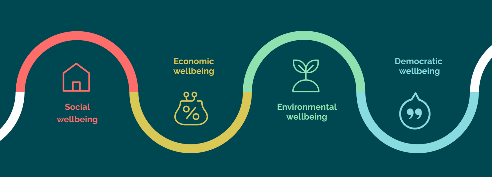
In developing their strategy, staff and trustees had refined a model of wellbeing which encapsulated the holistic approach to social progress their work would focus on. This gave us a great foundation from which to develop plain English statements to describe the wellbeing outcomes in their model.
- Social wellbeing: We all have our basic needs met.
- Economic wellbeing: We all have a decent minimum living standard.
- Environmental wellbeing: We all live within the planet’s natural resources.
- Democratic wellbeing: We all have a voice in decisions that affect us.
However, we needed a strapline which could encapsulate the Carnegie UK concept of wellbeing. Through workshops, interviews and testing, we arrived at ‘collective wellbeing’ to describe the impact of the four dimensions of wellbeing set out above being considered together and with equal importance. Looking after the wellbeing of all citizens – our collective wellbeing – is a powerful way of creating a society where everyone can live well together.
We wanted to put this mission into the heart of the new look and feel. Helen of HHolden Design created a logo where ‘collective wellbeing’ leads the visuals. The four ‘Cs’ of the graphic motif within the logo stand for the C in Carnegie and represent the four dimensions of collective wellbeing. It is inspired by, and represents, the values of collaboration and kindness, as the Cs come together. These are followed through in brand graphics created from circles and rounded icons to give the staff team a flexible brand that is practical to apply. The colour palette is a rich twist on the blues and teals often associated with wellbeing and inclusivity, with contrasting ‘pop’ colours which the team can use for emphasis.
Despite having a well-established rebranding methodology under our belts, it was initially daunting to consider rebranding an iconic 100-year-old institution while working entirely online. Important stages of any rebrand are developed when in the same room with staff, trustees and other stakeholders. However, by some judicious rethinking of creative workshops and scheduling numerous online interviews and group discussions, we were able to adapt the usual face-to-face connections. The process was supported by the rebrand group of staff and trustees who provided valuable expertise, tested concepts with colleagues and made agile decisions along milestones.
However, critical to being able to deliver a whole rebrand project online were the weekly meetings Helen and I had with CEO, Sarah Davidson, and Head of Advocacy, Douglas White. With pop up appearances from pets, children and partners, we truly collaborated to create this brand to bring the strategy to life.
As we emerge from these extraordinary times, Carnegie UK’s approach to social progress through improving collective wellbeing is never more needed. Helen and I are proud to have created the brand to set Carnegie UK on this next stage of its journey to achieving this impact.
Help us make the case for wellbeing policy
Keep in touch with Carnegie UK’s research and activities. Learn more about ways to get involved with our work.
"*" indicates required fields
